02.

Mediamarkt

Checkout Experience

A sucessful Checkout Experience is one that reduces the time & effort it takes to complete the buying process.

MediaMarkt Saturn Technology is in the middle of a Tech transformation that showed up the need of a total renewal in the whole Webshop. The Checkout funnel is the strategic key to enssure the company profit, therefore a delightful experience when purchasing it’s a must for any e-commerce now a days.

Challenge & Outcome of MediaMarkt project - by metakitrina.fun
Information Architecture for the Checkout experience of MediaMarkt

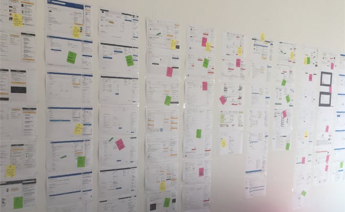
After Benchmarking the main German & International retailers, and following the best practices suggested by Baymard and NNG the project started with an extense analisis of the mediamarkt.de website (2017).

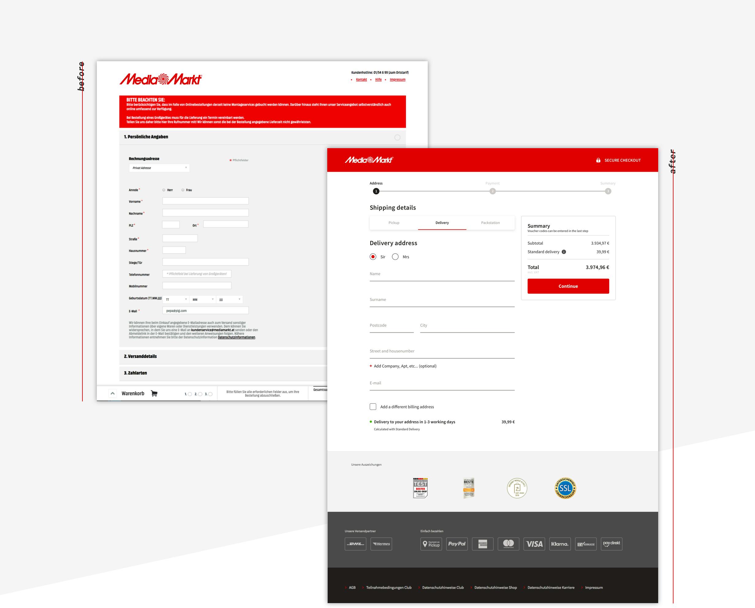
We saw a clear need to simplify the checkout process, get rid of all distracctions that the funnel had, and provide a clear structure that enssured the users in which step of their purchase were they, and how could they proceed without hesitating.
Benchmark
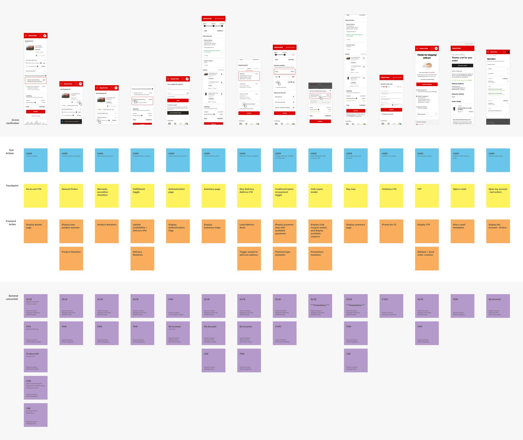
Blueprint to understand the complexity of the monolit

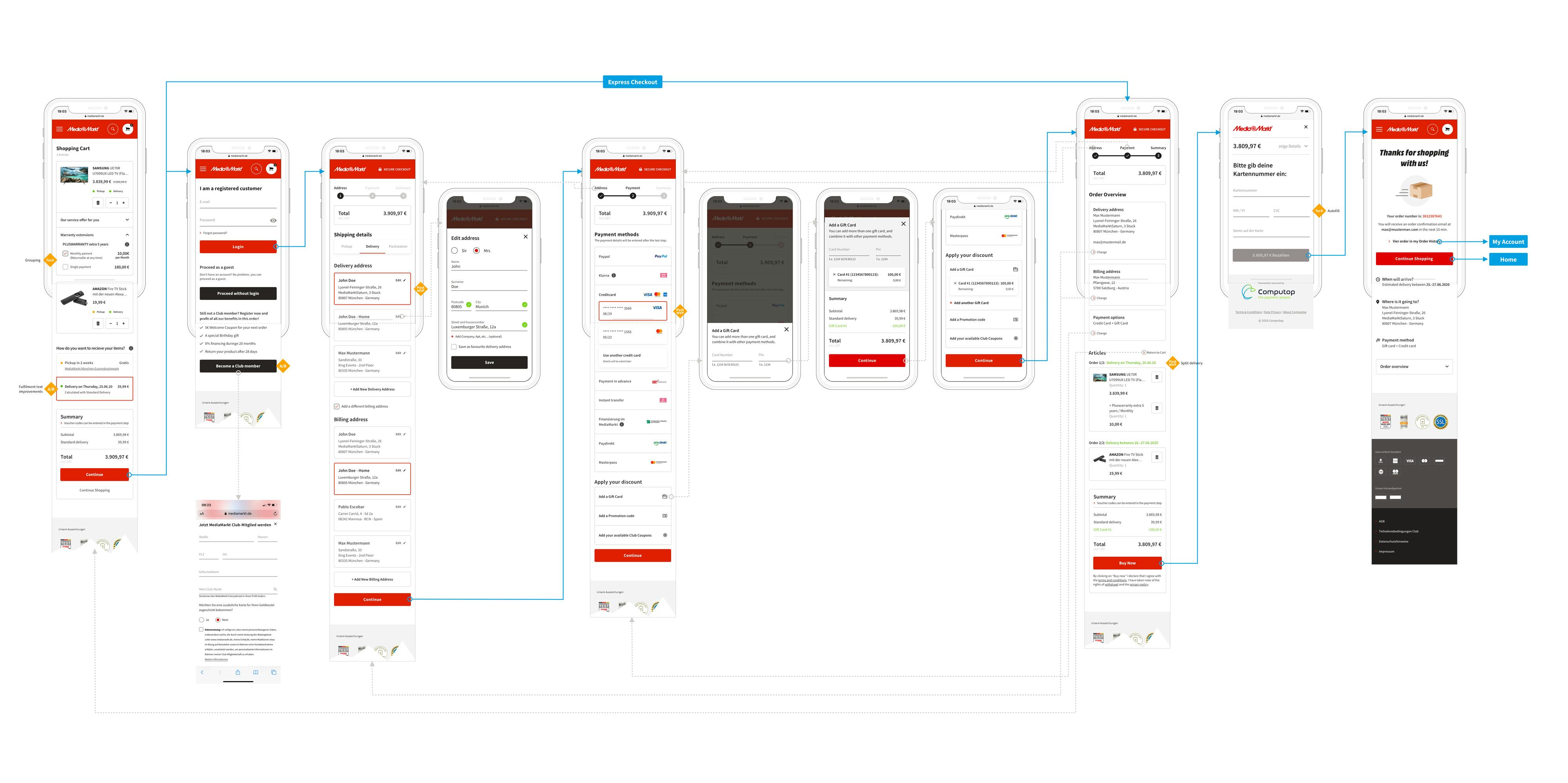
When I started to bring the concepts life, I truly discovered the complexity of such a big project. MediaMarkt had a legacy website with tones of dependencies and tech restrictions. That’s why I created a Service Blueprint with my team to reduce the complexity and visualize together the frontstage and backstage. This really helped all of us to make a realistic proposal that the devs could easily implement and mantain. Avoiding to fall again in huge and complex systems, that affect the user experience, and frustrate the teams when any improvement it’s needed.

Blueprint of MediaMarkt Checkout experience by Metakitrina
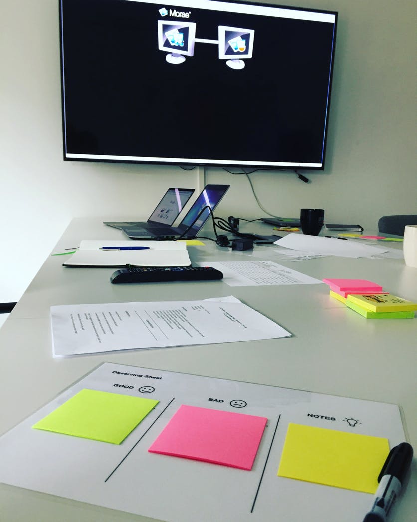
User testing setup for MediaMarkt Checkout Experience by Metakitrina
Validating the designs

I conducted several usability testing sessions in-house with our primary users. The tests were often task-based, and the same user had to perform the test task in 2 different versions of a prototype. The goal was to compare the performance in both versions (time to complete, attractively, security…), and verify which version was more friendly for our users.

Apart from creating a specific script for every test scenario, together with our Research colleagues, we established a basic survey to be used in every interview, regardless of what experience where we testing. With this basis, we could extract 

a general overview of the user’s perception among our Brand, and contrast it with our user personas.

Apart from the in-house usability sessions, we also validate other ideas remotely, with UserZoom. This allows us to quickly validate our assumptions and have results in less than 24h.

Why should users buy at MediaMarkt?

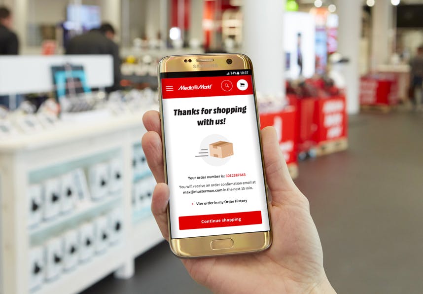
Even if nowadays buying online feels natural to most of us,  we know that some of our users still like to go to our Markets and check the products before buying them. That’s a unique advantage for MediaMarkt, that we potentiate with an enriched Omnichannel experience. 

Offering a seamless experience among devices and stores it’s one of the main KPIs of MediaMarkt. Using the Markets as an extension of our website we can offer an extra service that our main competitors can’t. That’s why the MediaMarkt Experience it’s so unique.

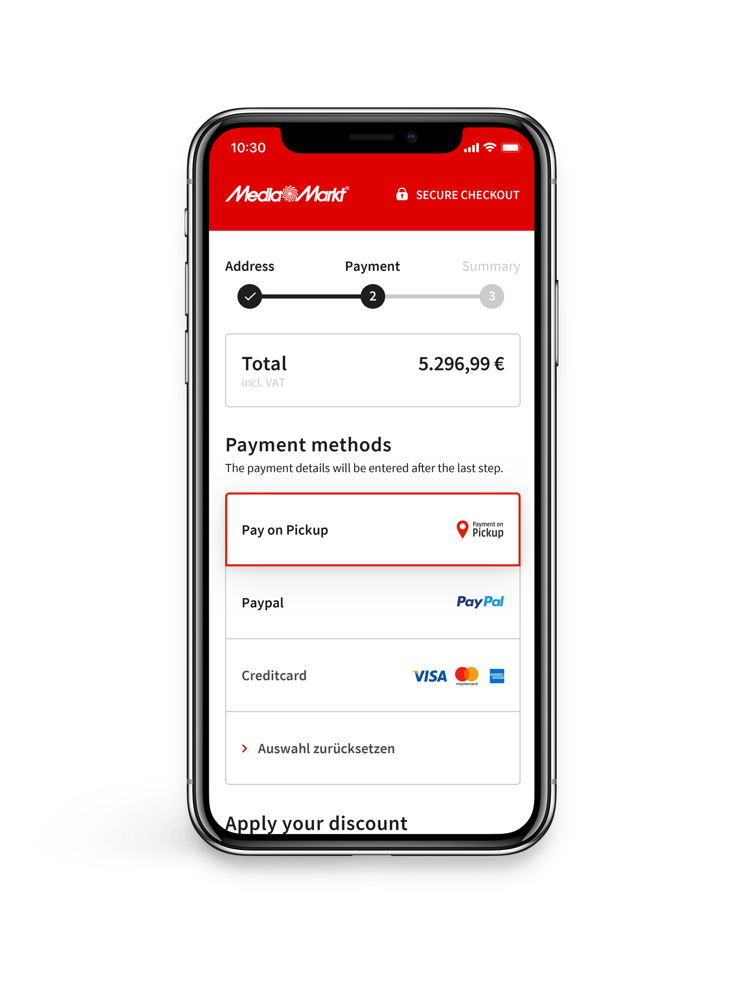
Checkout experience - Omnichannel from MediaMarkt by Metakitrina
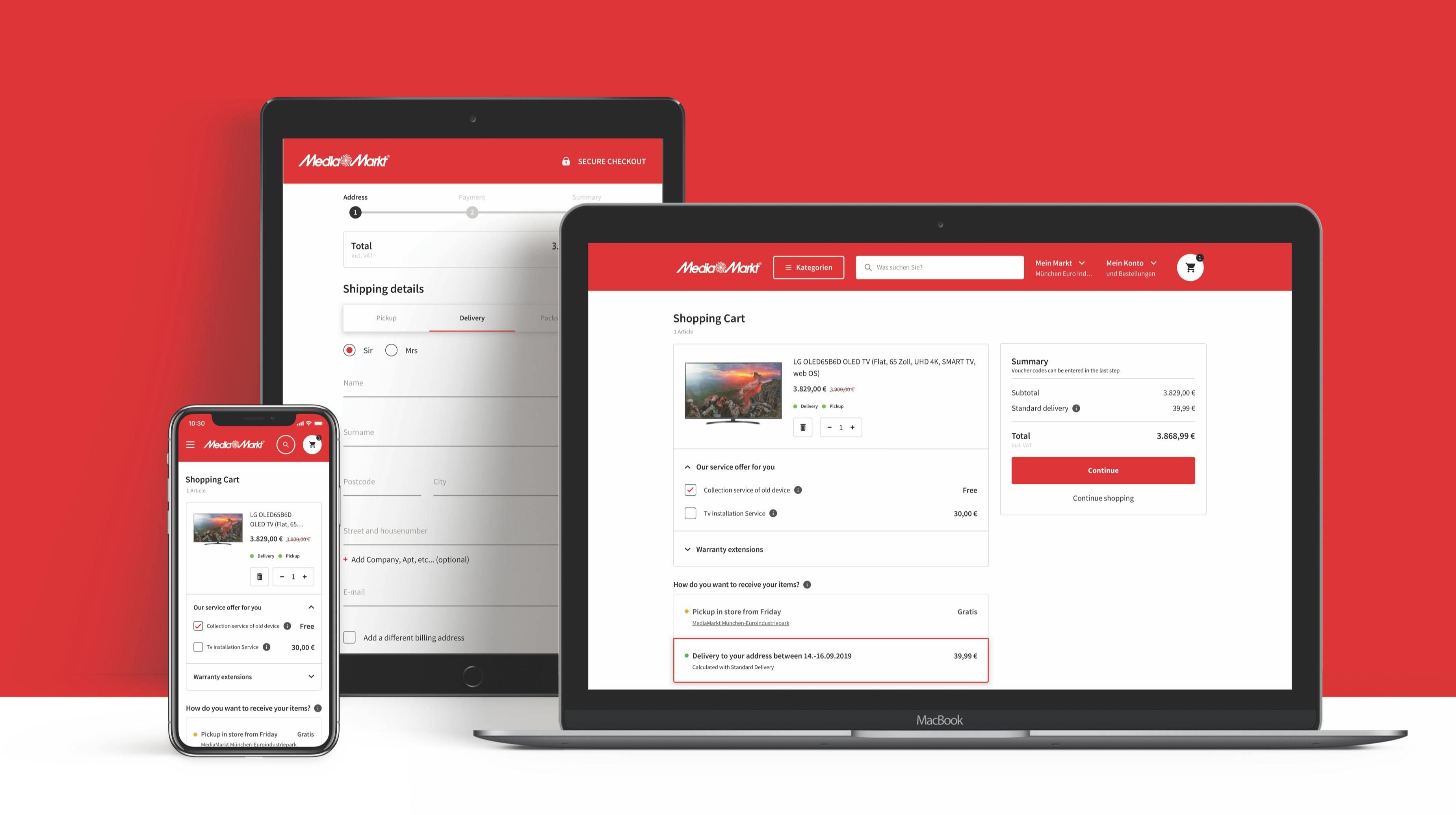
Before - after of the Checkout experience of MediaMarkt - By Metakitrina
Making every piece fit!

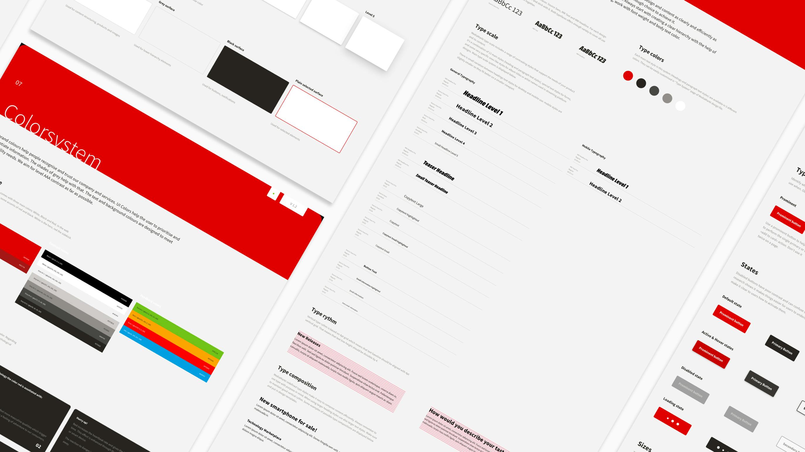
With the new MediaMarkt Design System, created among the UX Chapter and the Brand department, the whole team shared their unique perspectives and needs with the goal to create a reusable component library that unifies the experience of navigating through MediaMarkt online and offline.

This system is not only used in the webshop and consumer app. Also consumed by our internal systems, store manager APPs, cash registrators,… And will soon be implemented in physical branded elements in the stores and commercials.

The Checkout Experience directly influences brand perception, propensity for return visits, and an organisation’s ability to drive revenue online.