05.

CrediMarket.com

Rebranding and styling for Credimarket.com, the bank comparator leader in Spain.

Since 2008 Bankimia.com had given service to help the users to find the best financial products adapted to their needs. In 2017 the company, after years of growth, decided to adopt a new name and style more fresh and dynamic, creating CrediMarket.com

I had the pleasure to work as Head of Design during this transition. Working with the IT and Marketing team we build a solid brand with a new logo, style guide and communication tone, that doubled the % of leads on our landing page, in less than 3 months.

Challenge & Outcome of Credimarket project - by metakitrina.fun
Credimarket logo by Metakitrina
Ideation Workshop at CrediMarket by Metakitrina
New structures & performance optimization

With a clear business strategy and knowing the potential users that we needed, we did 3 co-creation sessions with different stakeholders from the company.

The objective was redesign not only the hole website, also the landing pages and white labels, and improving the performance and quality score of our communication.

To do that we count with a Google team working closely with the UX, Marketing and IT team of the enterprise. After months of work, we could proudly say that all the challenges were achieved.

Think with Google case

A Mantainable Design System

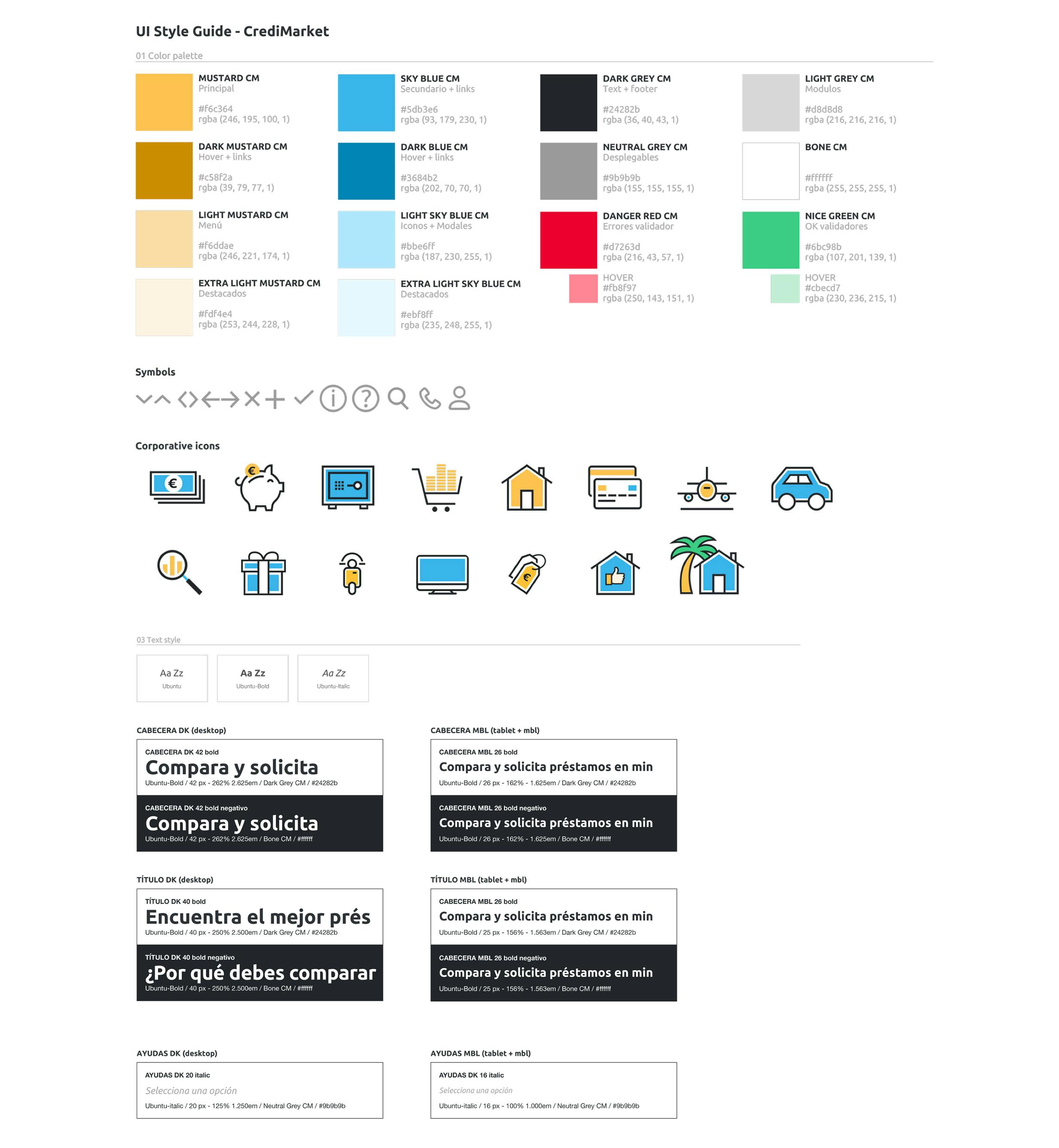
With a clear Style Guide the redesign of the home page, FAQ forum, product pages and landings were easily scalable.

The product pages included the first step of the funnel, getting more engagement. And the landing pages were transformed from basic forms to wizard forms. Increasing the % of conversion to the triple than the previous year.

Design System of CrediMarket by Metakitrina
Wireframes of CrediMarket by Metakitrina