MUHBA Interactive
Experience
MUHBA is a new way of visiting and interacting with the History Museum of Barcelona.
We proposed a new way of visiting and interacting with the museum, after analysing the situation of the principal attractions of Barcelona.
This project was realised during our master in UX Design with the UX Researcher Xavi Sorinas, and the Interaction Designer Mariana Hormaza.

Our first steps were searching all the information about the principal attractions in Barcelona, and more particularly, about MUHBA, and contrasting them with the brief of the client. We found an official study from 'Institut de Cultura' that gave us the first insights. With this base, we wanted to make sure that the data given was real, so we went out to the street to contrast the information with the reality of the museum.
After a week of interviews with around 15 visitors and 5 stakeholders, we had qualitative data to work with. The first impression was that the brief of the client and the reality of the place was quite different. We also did an online survey to 100 potential users, using the tool Typeform from which we obtained quantitative data that verified our suspects and the official study that we found at the beginning.
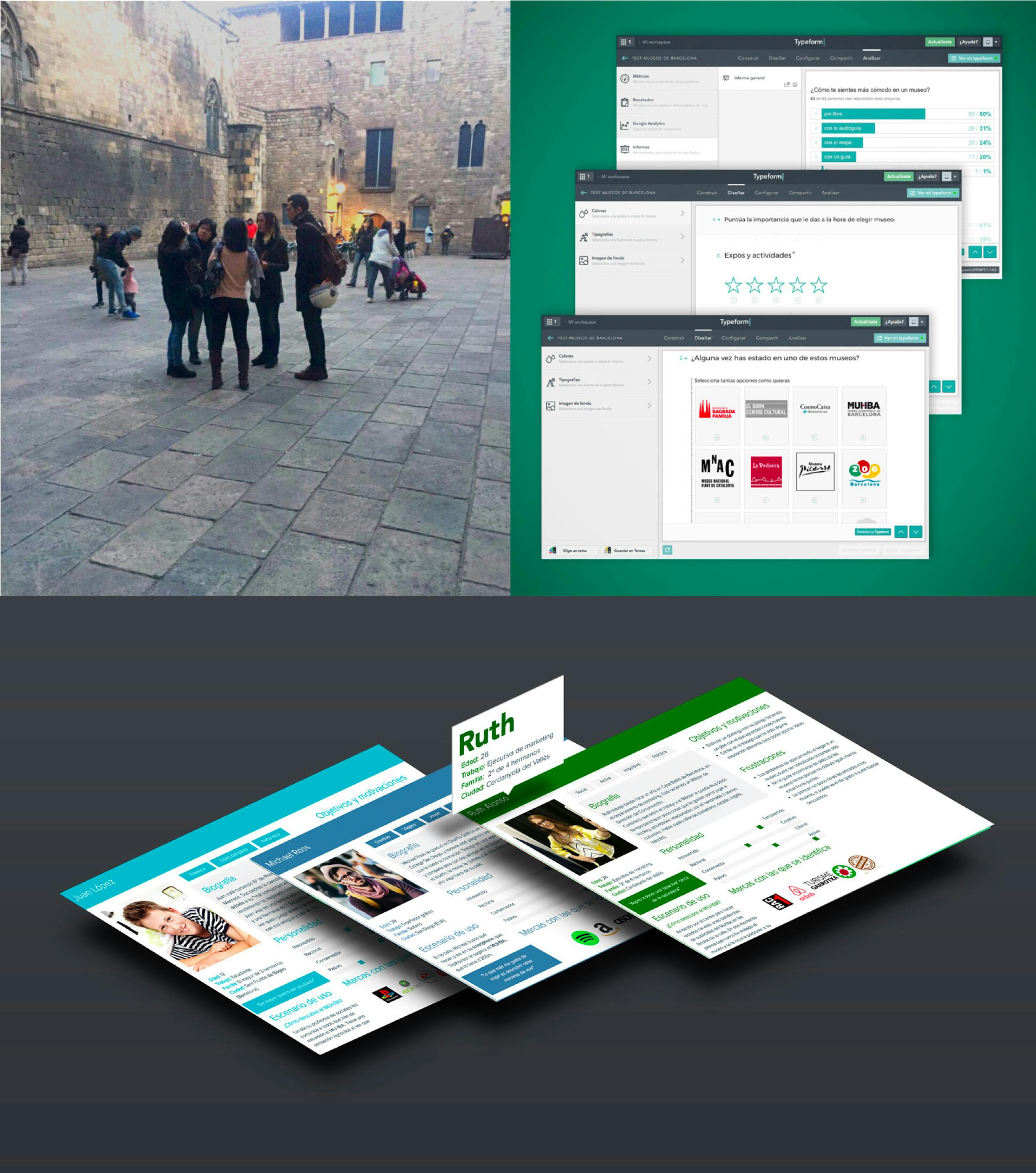
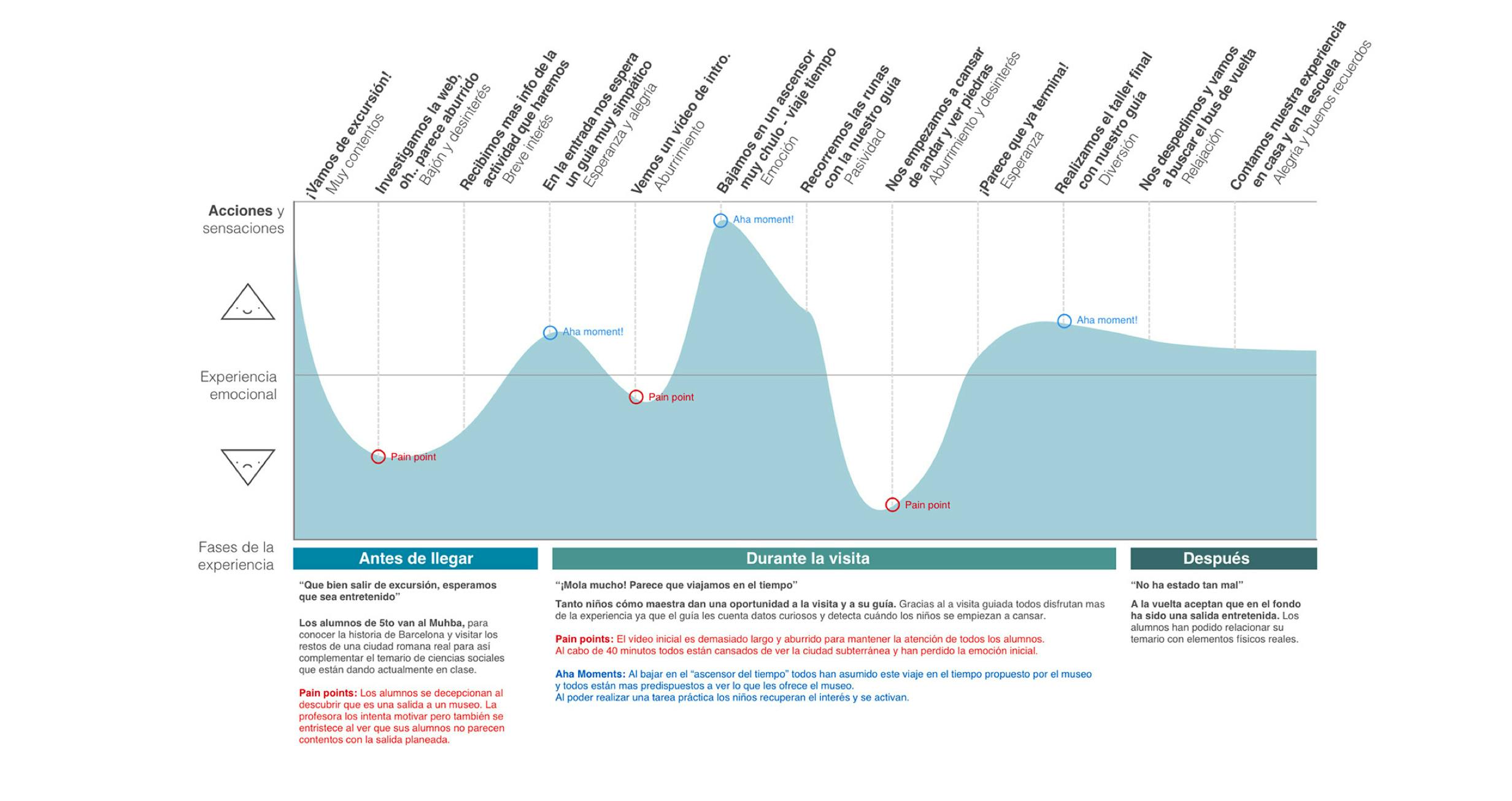
At this point, we knew our real users' thanks to the research and the ones that we didn't have but wanted. In this phase, we defined our objectives and using the technique of Personas, Journey and Empathy maps we build a full scenario of our primary user 'Ruth' the citizen of Barcelona, and the 2 secondary profiles, the kids of the schools and the tourists.
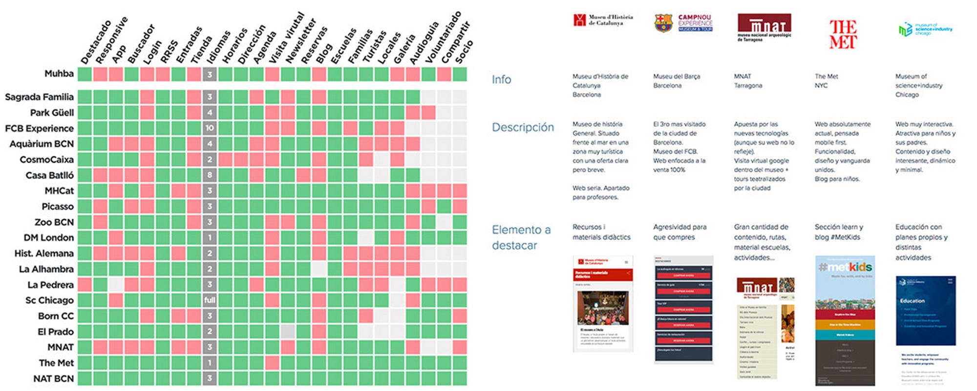
With the Benchmarking we identified some interesting features from the competence and after a Heuristic analysis of them, we could start to list our "to-do's" combined with the data from research to start the first sketching sessions.
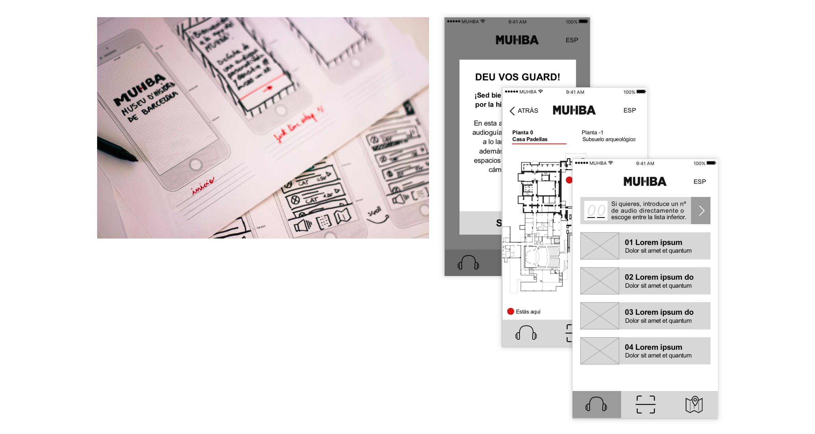
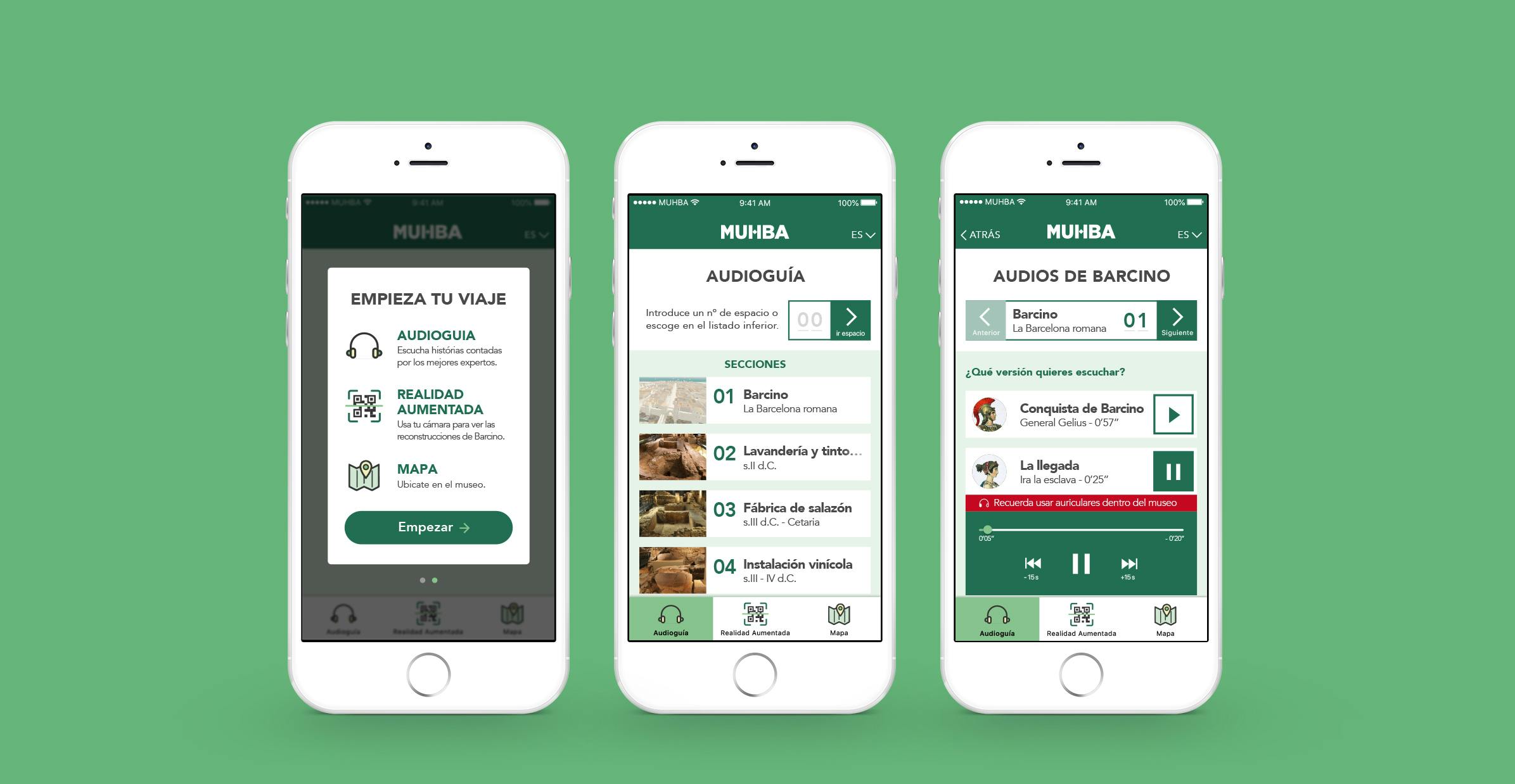
For us it was clear that once the users are convinced to visit the museum, the experience they live inside has to be memorable. That’s why we focussed our efforts in conceptualising an interactive APP that could bring a new perspective to fulfil all the desires the users expressed during the interviews.
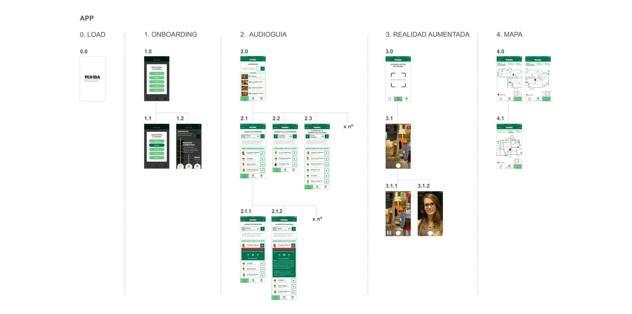
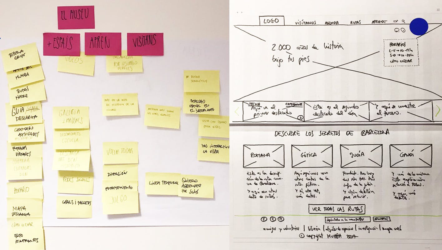
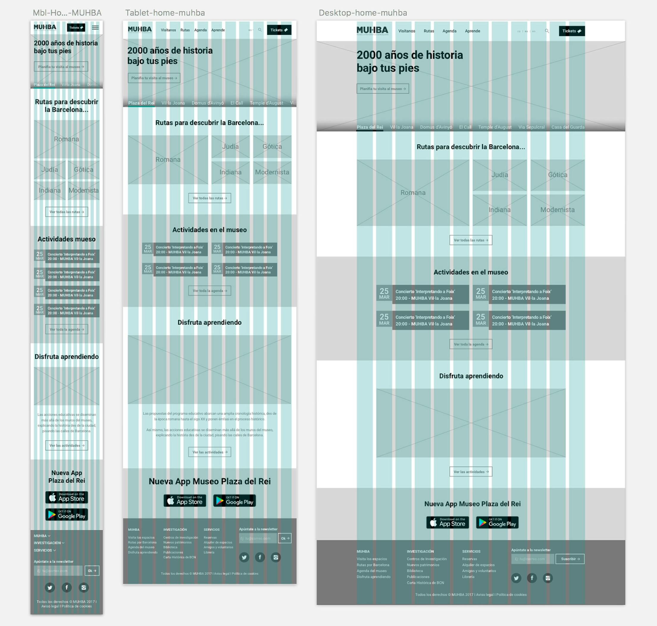
After the paper prototypes, we did the first wireframes thanks to Axure, and after a few rounds of testing, and some discarded ideas, we had a solid structure to start to design. The website redesign was clear. A responsive 12 column grid which allows the editors to post and update all the media and events easily.
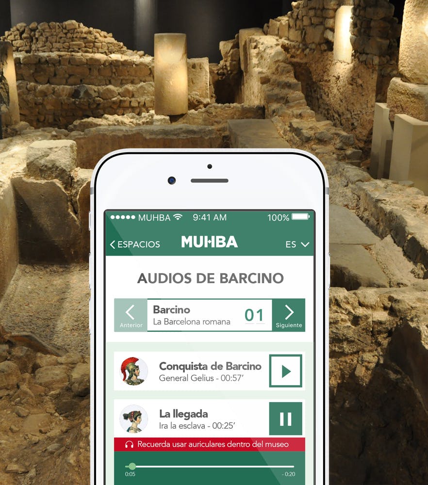
The new APP was a different thing, we included new features, such as VR to improve the experience inside the museum, so the testing rounds were more exhaustive to achieve an easy interface which could be used by every visitor of the museum.
We got a successful APP thanks to the Card sorting and Information Architecture work that we did during the design process.
